My previous personal brand RD Designs no longer reflected the direction I was taking as a designer. The logo lacked distinctiveness and needed a revamp! This coincided with the development of my online portfolio. Therefore, I needed to develop a new sense of direction in my personal brand to be included on my website.
My Rebrand
Overview
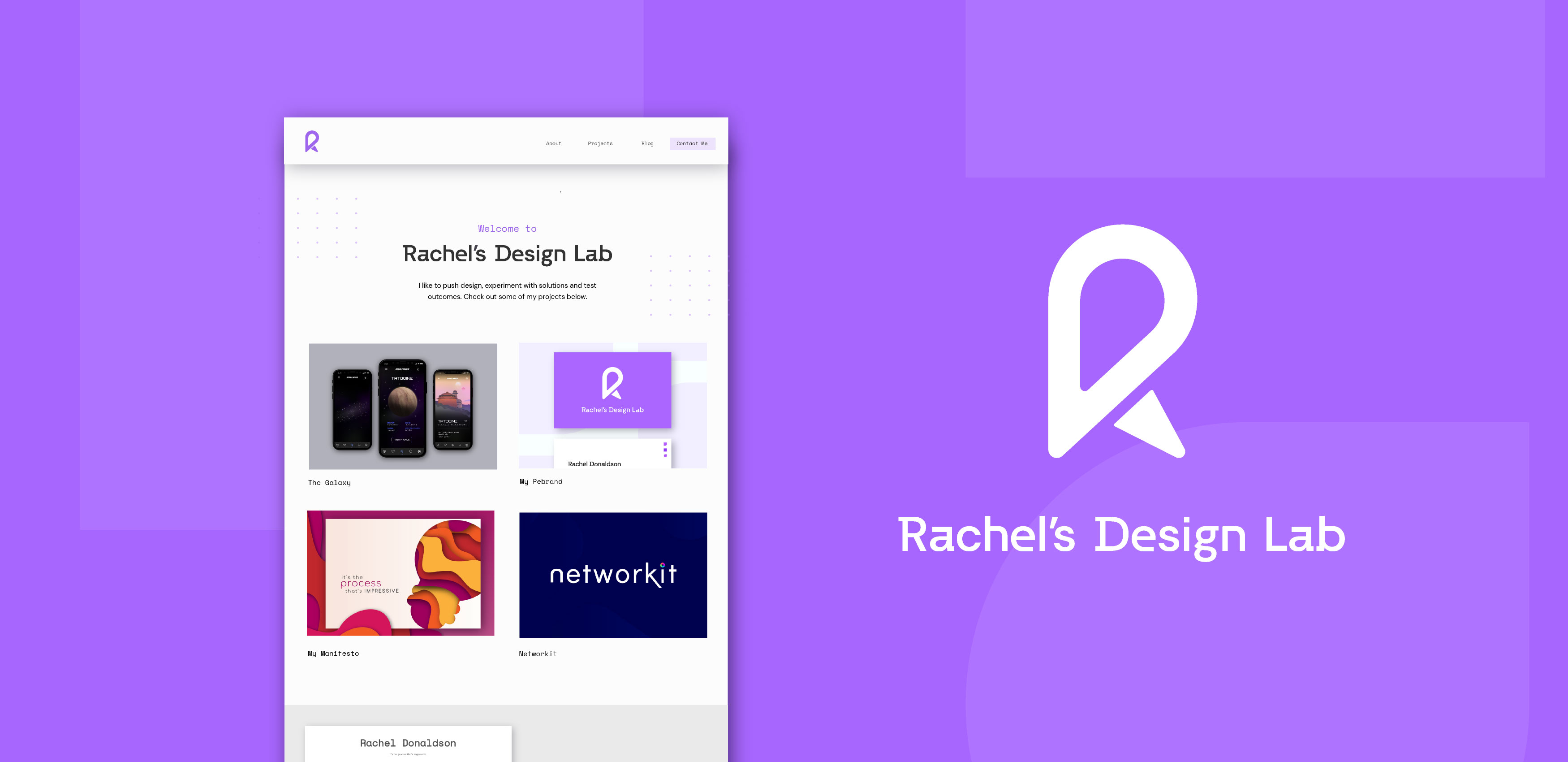
Rachel’s Design Lab is my updated personal brand identity. The brand reflects my new focus on UX and UI Design. The goal of this rebrand is to freshen up my online presence with a personal brand that indicates my structured and experimental approach to design.
Problem
Solution
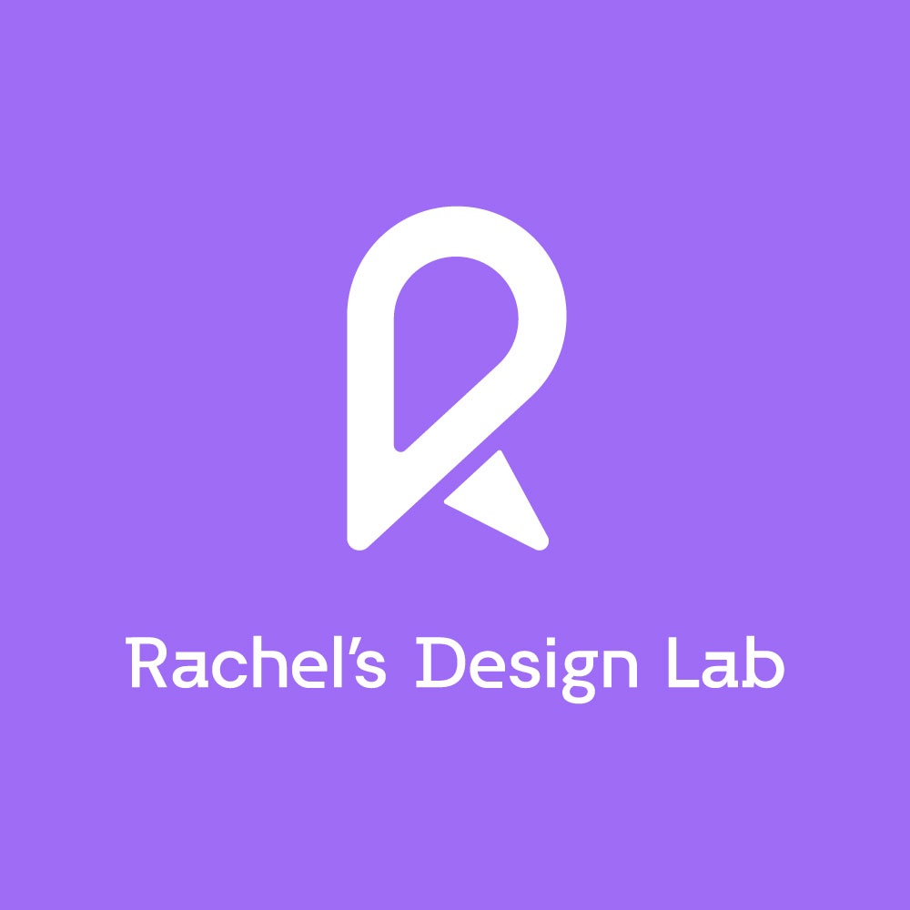
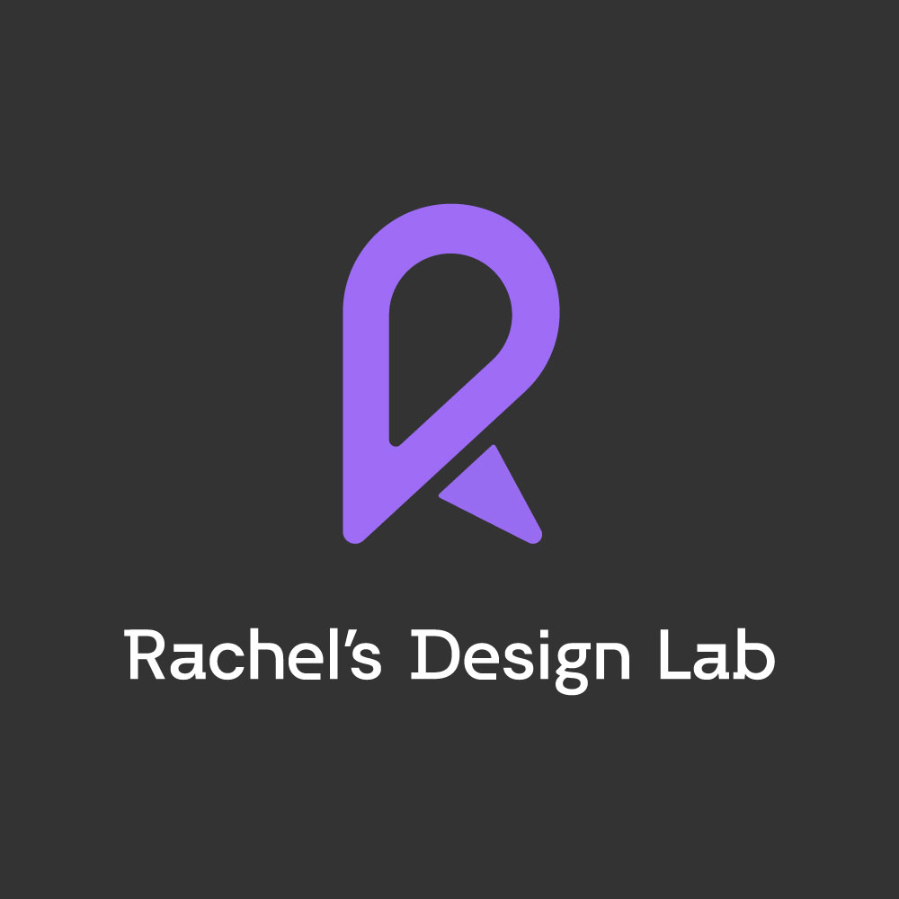
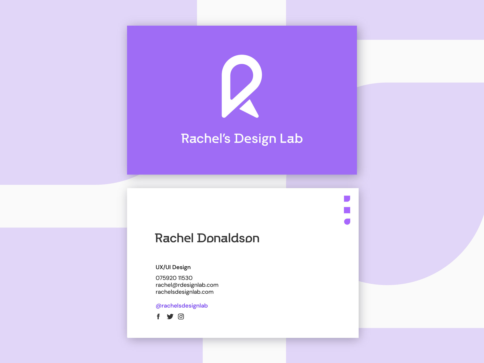
I have designed a monogram and wordmark that better fits my new direction as a designer. I also updated my name from RD Designs to Rachel's Design Lab to capture the fun and experimental portions of my work as well as my process driven approach to design. The lab theme runs through the icon set I have developed as part of the rebrand. I have incorporated my personal brand on my portfolio website and presented prototypes of how the brand could be included on touchpoints.
Research and Exploration
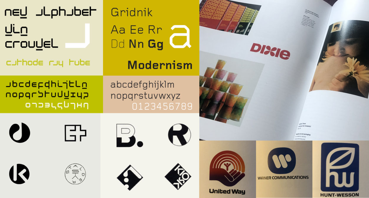
I researched leaders in the field of type and graphic design including Wim Crouwel and Armin Hofmann, as I wanted to adopt a modernist approach in my wordmark and monogram. I also looked to designers such as Saul Bass and researched colour, type and web design in good detail to develop a clear direction for my brand and website. I have included some examples of the work I drew inspiration from below.
Experimentation and Development

Monogram
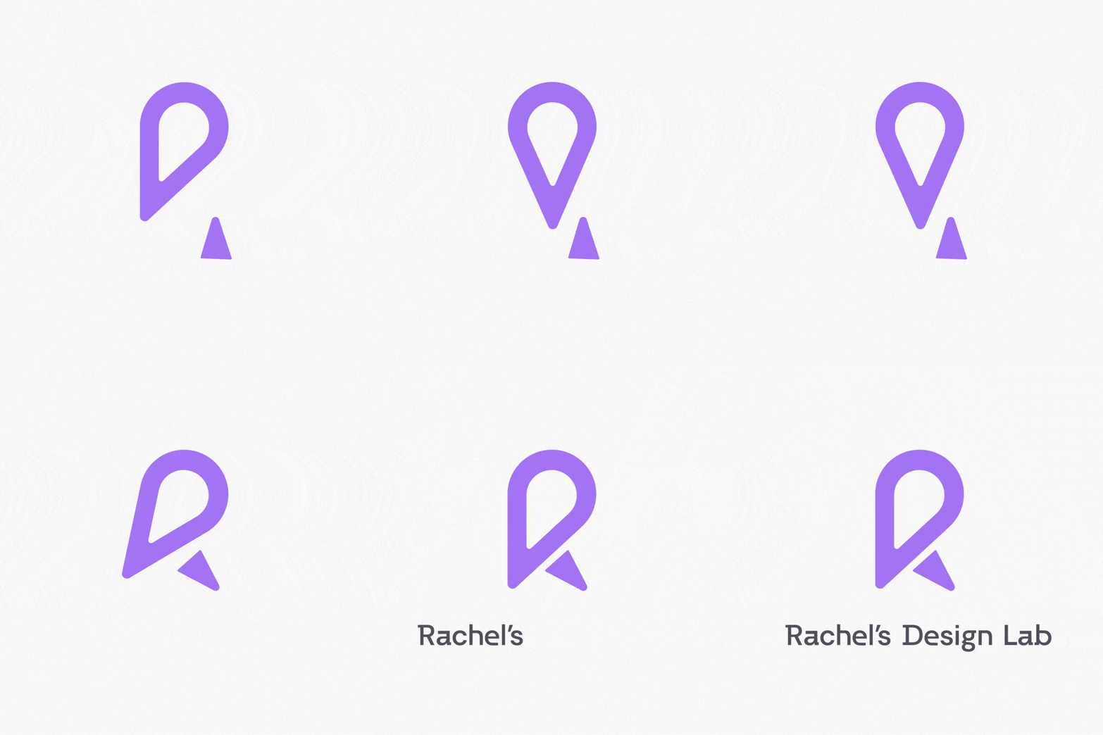
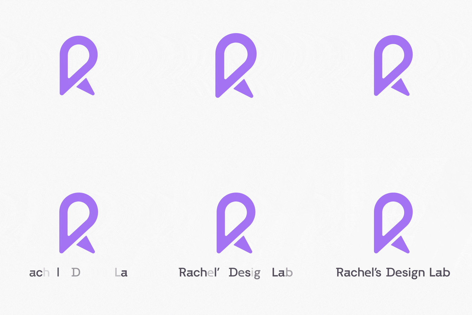
The monogram was created by initially sketching ideas and combinations of the letters RD to present Rachel’s Design Lab and my name Rachel Donaldson. I selected the outcome I felt was most unique and memorable. I also liked that the ‘D’ could be found within the ‘R’.

Wordmark
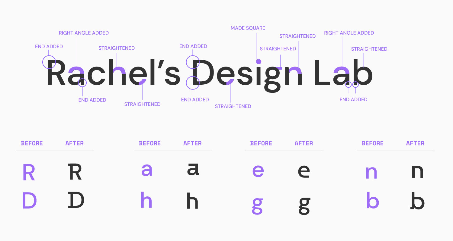
The typeface DM Sans was used as the basis for the customised type the wordmark was created in. Portions of the letters have been straightened to create a more interesting digital type feel to the wordmark.
Icons
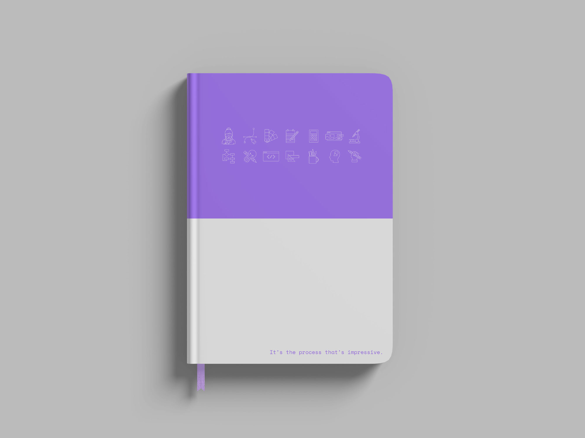
Icons were first sketched and then drawn up on illustrator. The style was influenced by the visual marquee created of a lab worker that was not selected for the logo. As the outcome brought out the lab theme I decided to incorporate it as part of an icon set. I experimented with different styles and sizes. I chose the best outcomes and then recreated each using a guide to ensure visual consistency across the set
Typography
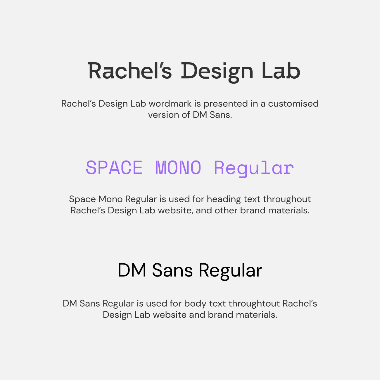
The wordmark has been created in a customised version of DM Sans. Space Mono has been selected for all headings due to its bold spacing and digital type feel. DM Sans has been selected for body text to compliment the wordmark and to make the body text clear and easy to read.
Colour
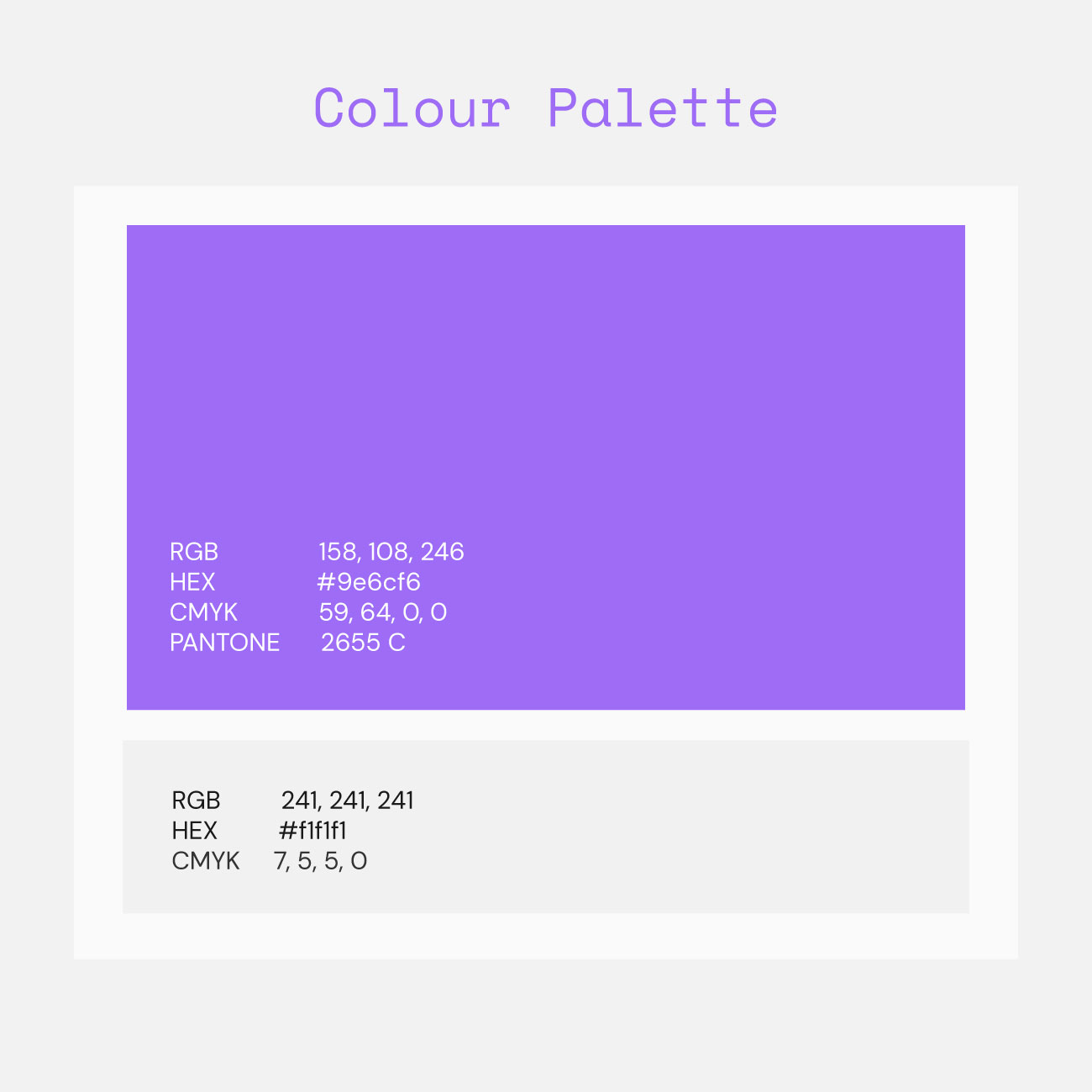
A monochrome colour scheme has been selected for Rachel’s Design lab using only a vivid purple and off white. This compliments the brands desired minimalist outcome.
Website
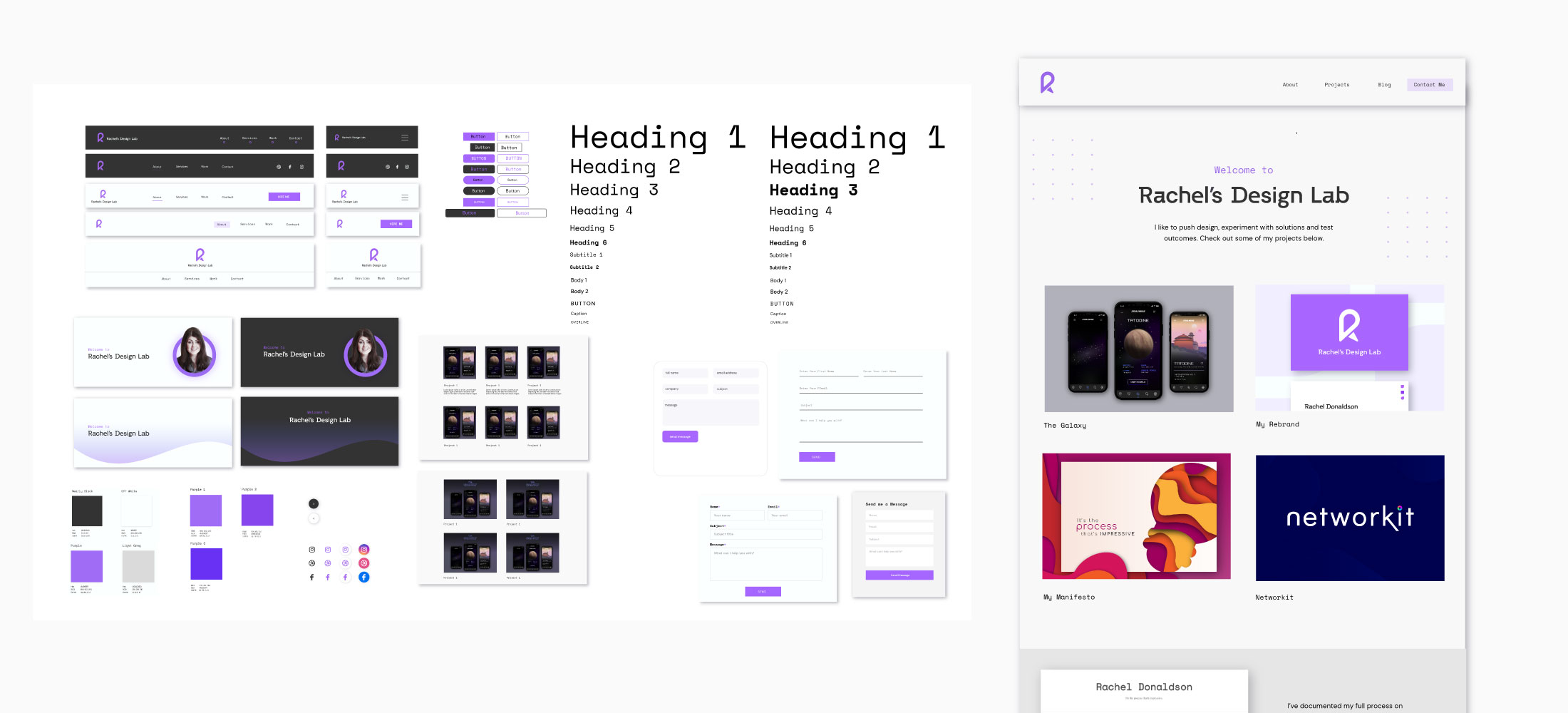
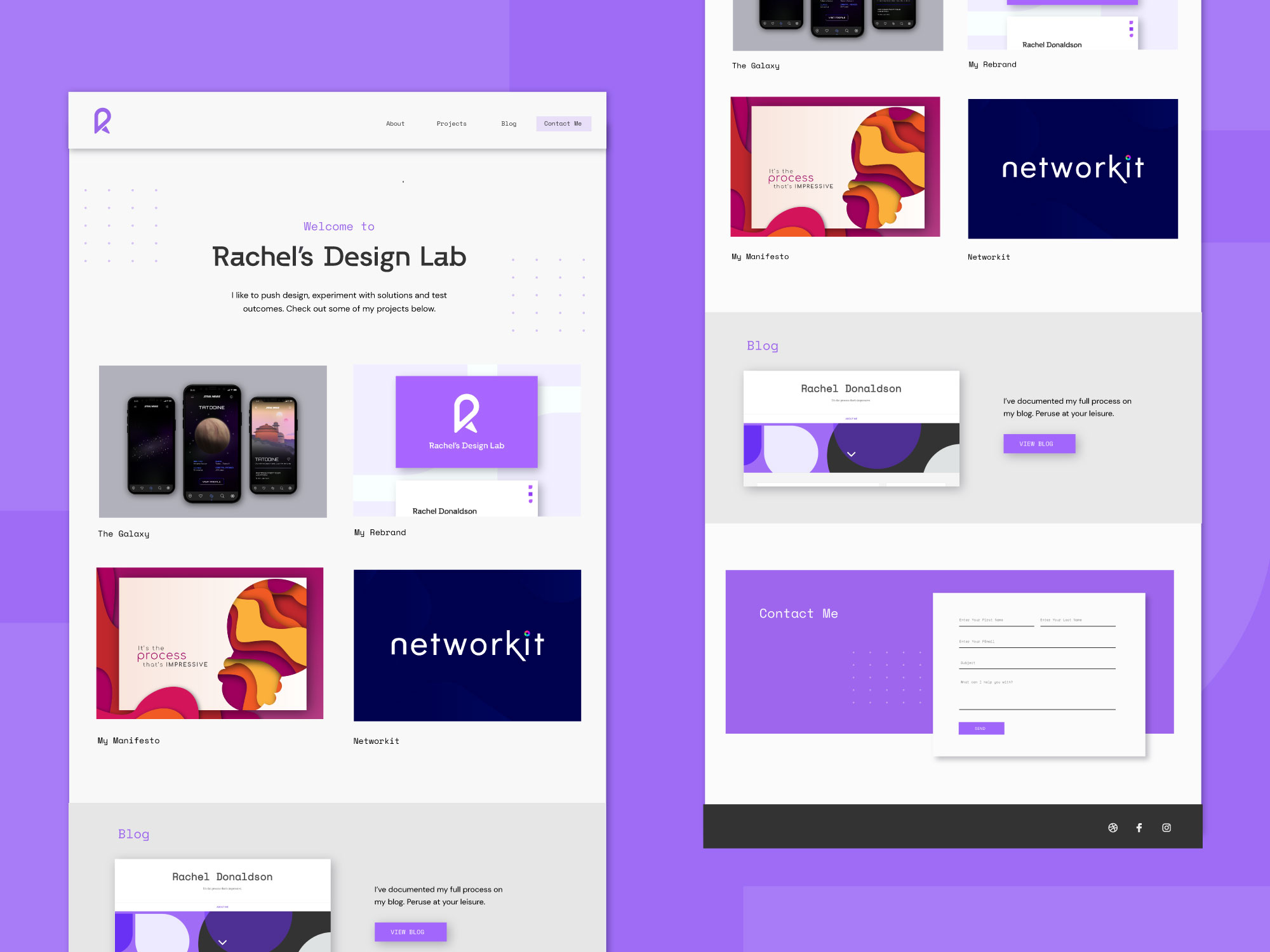
The website was created through the production of several wireframes and the creation of an element collage which lead to the final mock-up.
Results
Get in Touch
I’m always up for making new connections.
Feel free to contact me.